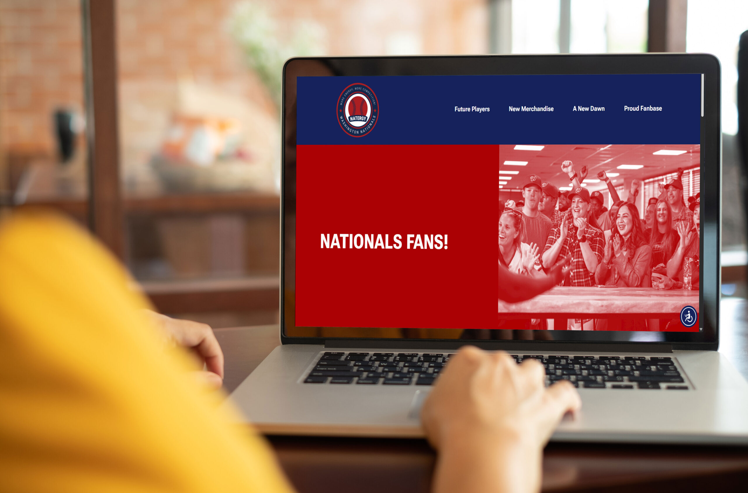
Design Challenge
Airline brands have functional benefits that are not prioritized in their brand identity. Instead, brand identities utilize emotional benefits that connotate subjective ideologies such as unity and patriotism. To overcome this confusion, Velocity Airlines is introduced to prioritize the functional benefits of their aircraft.
The goal is to convince consumers to use an airline that prioritizes a swift flight timeline; speed + efficiency. Velocity Airlines will target business, budget-minded travelers, and first-class travelers since they frequently fly on airplanes and complain about delays from other airlines.

Airplane Interior

App
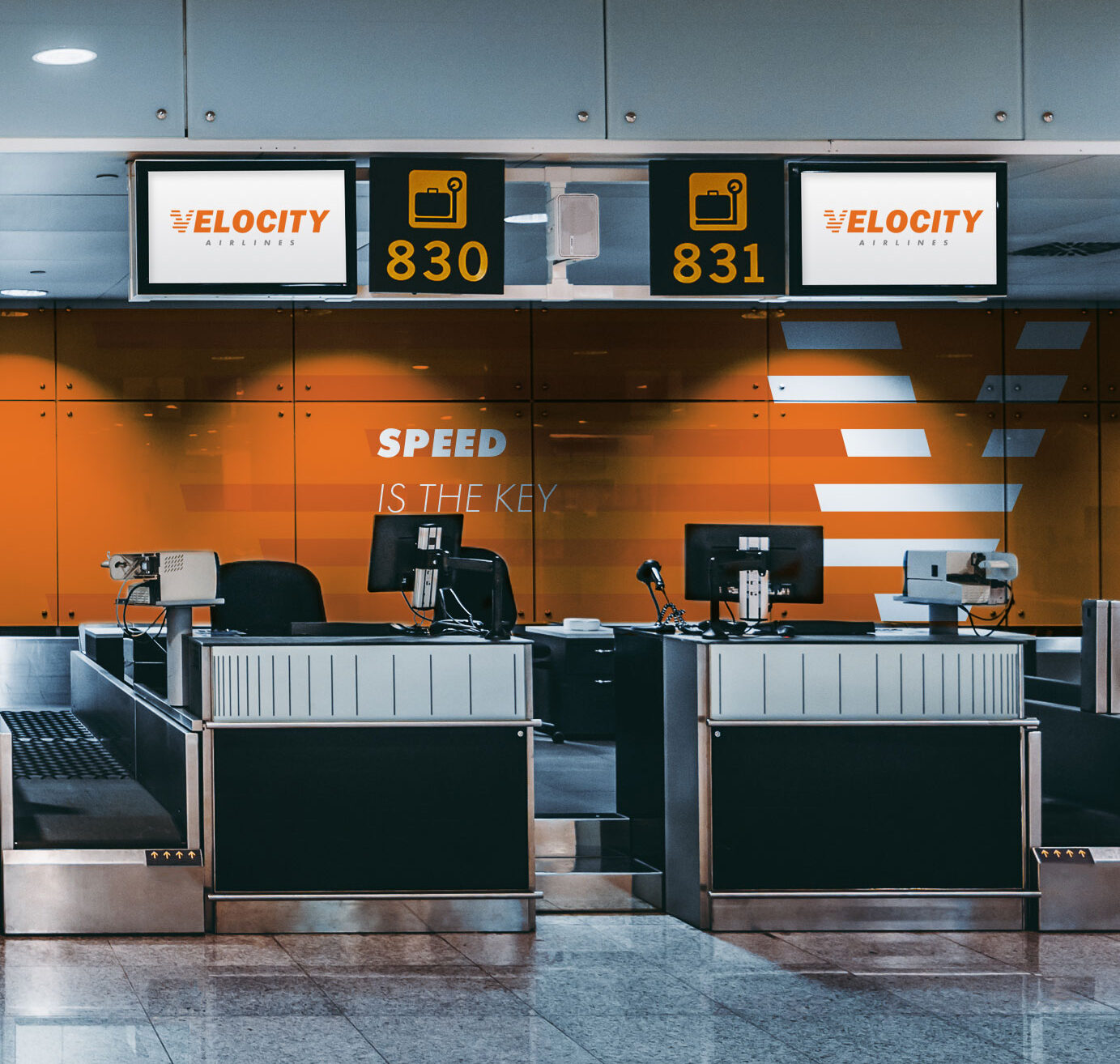
Baggage Claim Backdrop
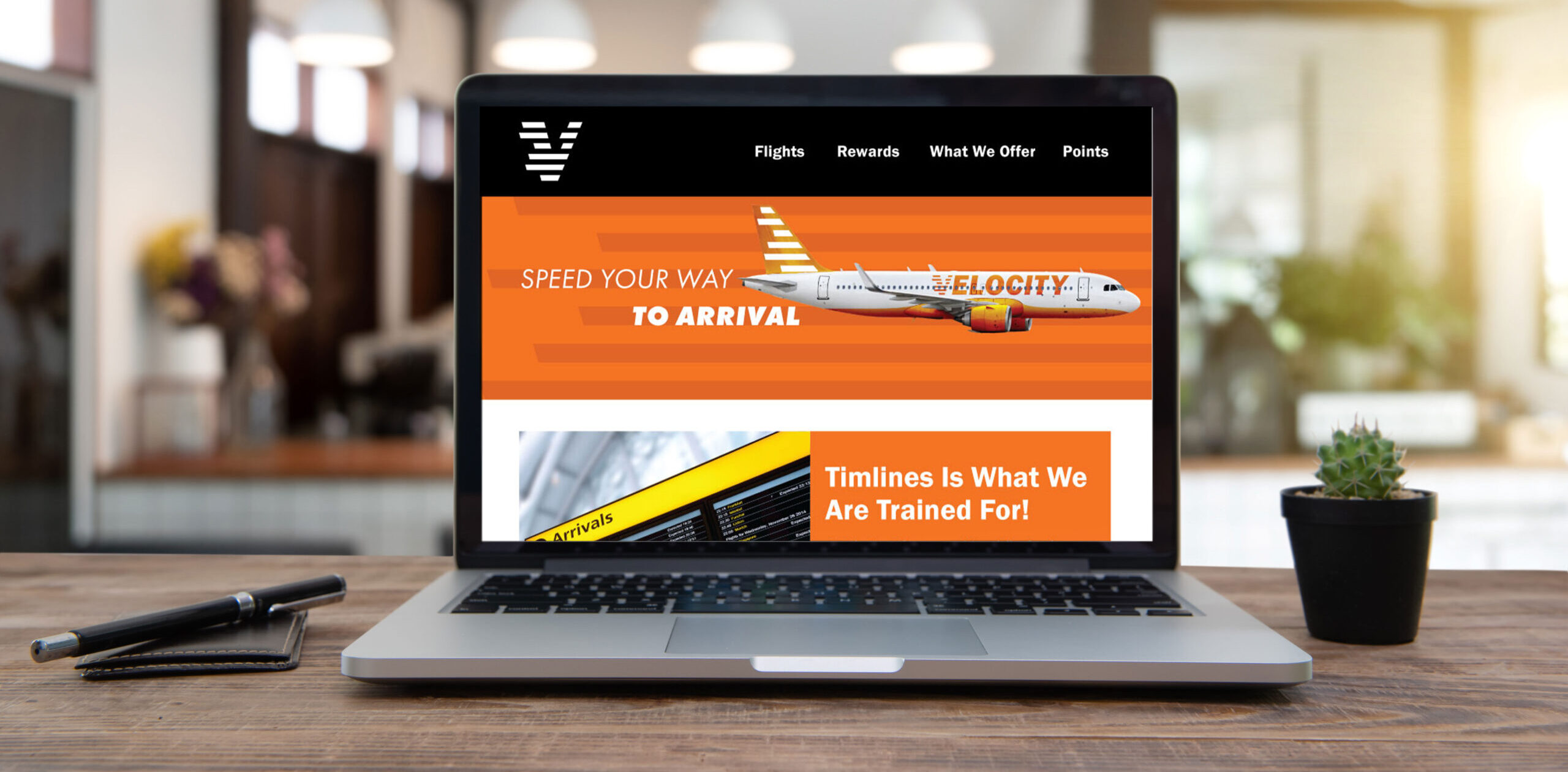
Website Landing Page
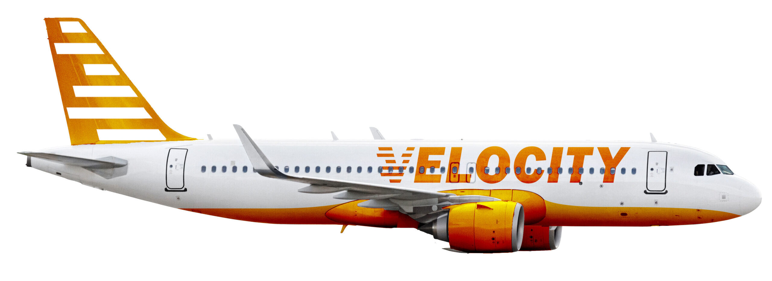
Airplane Exterior
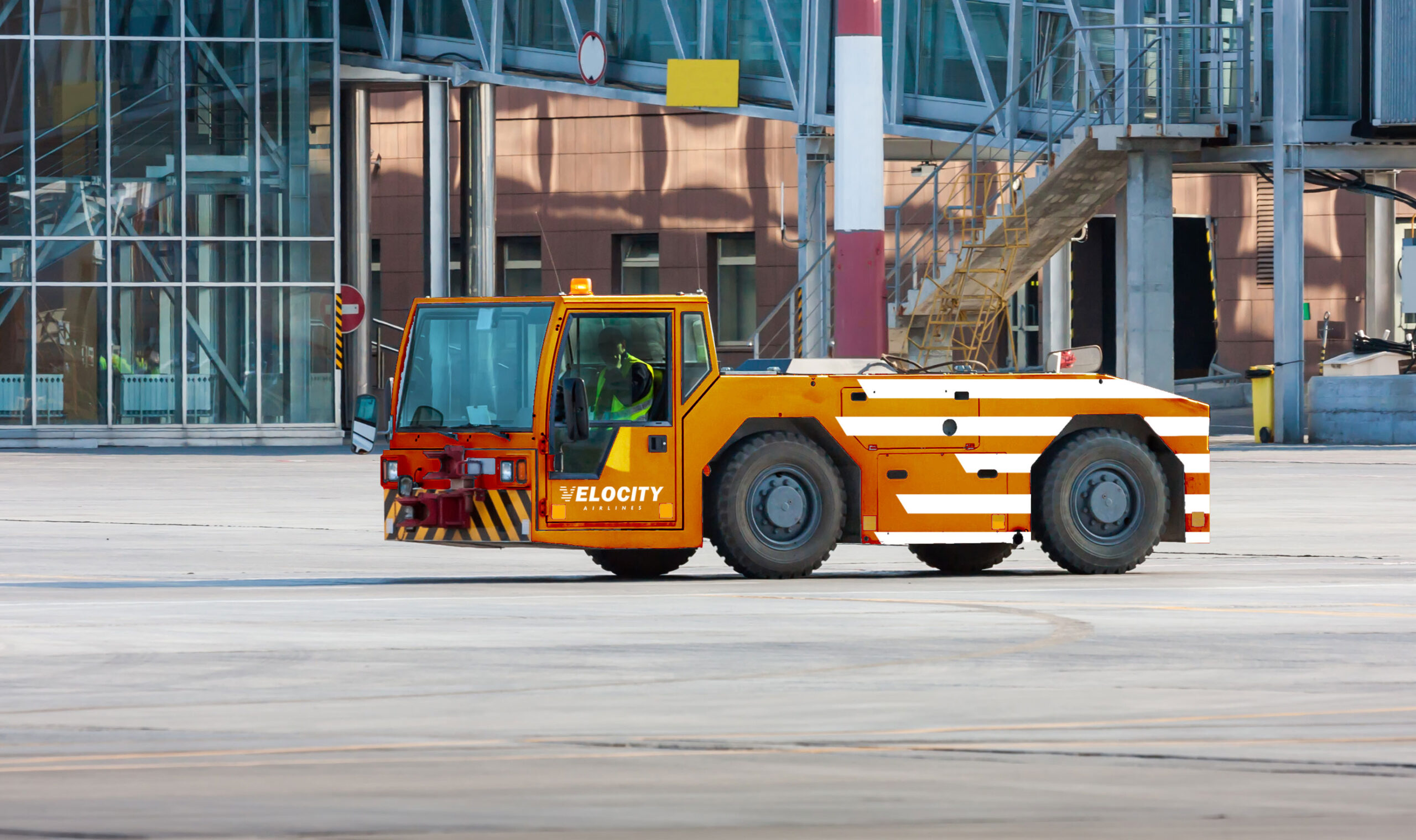

Airplane Ground Vechicles
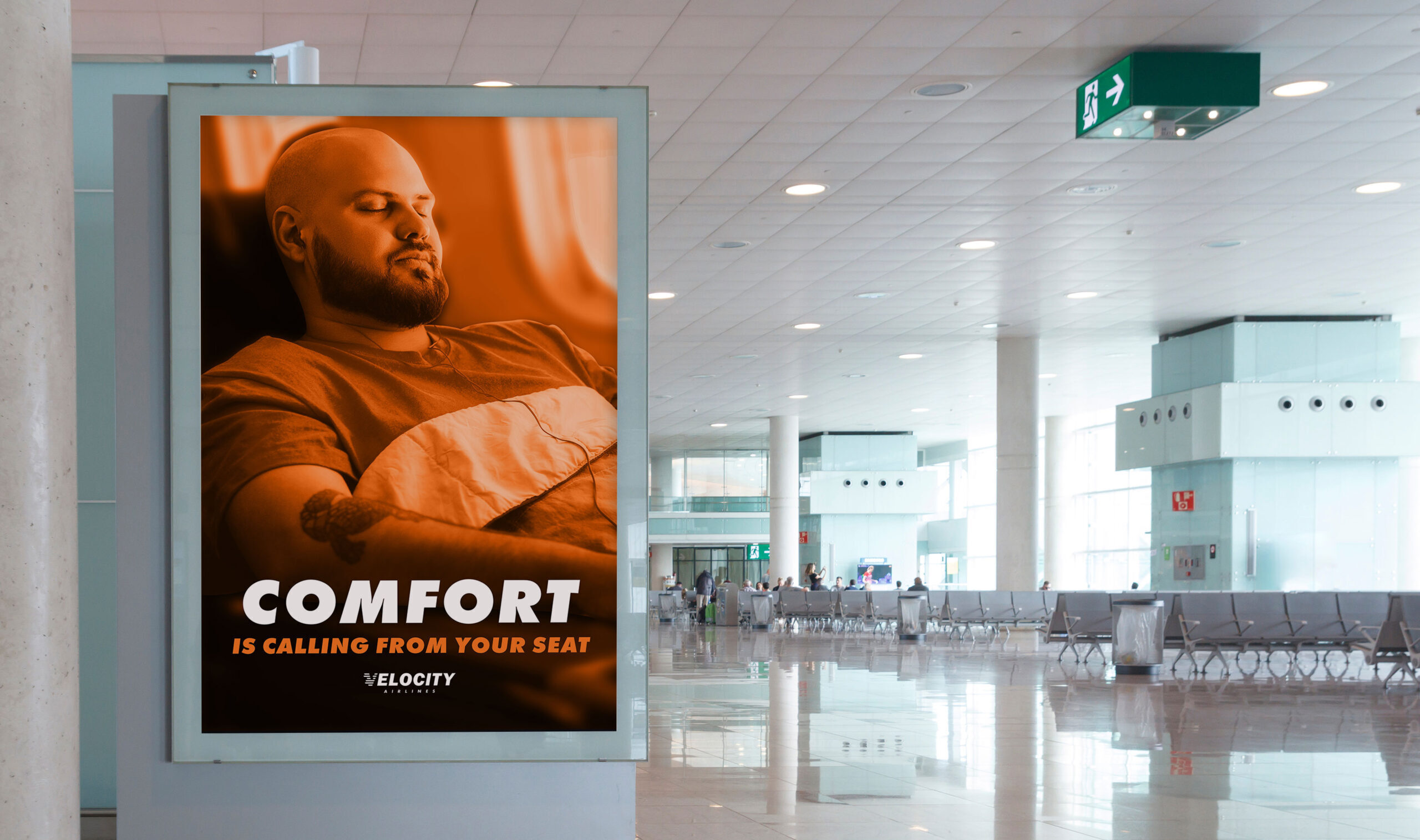

Airport Advertisements

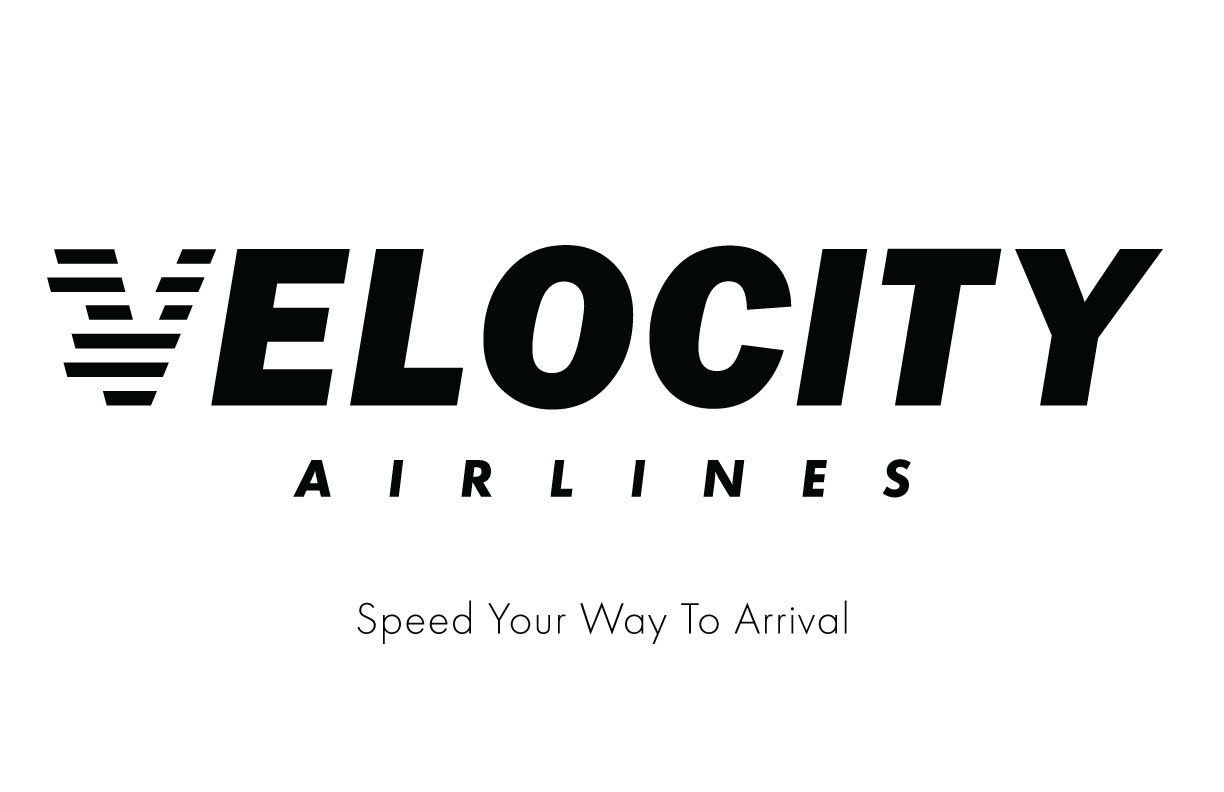


Logo
Color Palette
HEX: #f57421
RGB: 245, 116, 33
PANTONE: 1505 C
HEX: #e86900
RGB: 232, 105, 0
PANTONE: 159 C
HEX: #939597
RGB: 147, 149, 151
PANTONE: 5295 C
HEX: #000000
RGB: 0, 0, 0
PANTONE: Black 6 C
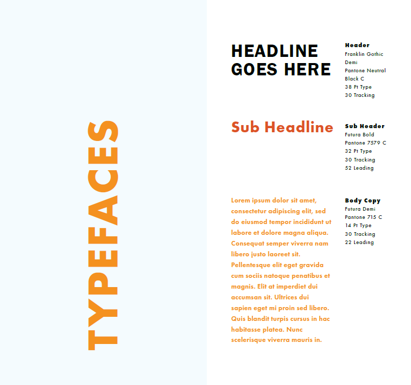
Typeface Study
Solution
By conducting research and sketching concepts, two logos were created. The secondary logo, which spells out “Velocity” and is italicized, represents an airplane’s directional movement and brand authority. The primary, “V” logo, which has lines ripping out of the “V,” represent the speed of a Velocity Airlines aircraft.
Additionally, an app/website mock-up, airline livery, catering truck, and more applications were developed. Each application is common for airport vehicles, airplanes, and user experience portions of airline brands. All the applications reinforce the identity through color, typography, photo manipulation, and the logo.
Project Outcome
As a result of the brand, consumer experience is enhanced due to the applied graphic design principles and brand features. This identity convinces consumers to think of Velocity Airlines’ airplanes as fast and safe vehicles that can transport them where they want to go.
Velocity Airlines’ customers report that high-quality service and takeoffs/landings are functions of their aircraft. Customers report that the airline delivers timely departures and arrivals due to efficient service and advanced airplane technology provided in the flying experience.


