Design Challenge
The goal of the campaign is to depict the harsh reality of hurricanes, set a tone that reinforces the Salvation Army brand, and encourage participation in donation. To achieve this goal, the Salvation Army seeks to market the brand, have greater exposure to the issue, and target new donors. The audience of the campaign are corporations, local leaders, and altruistic citizens.
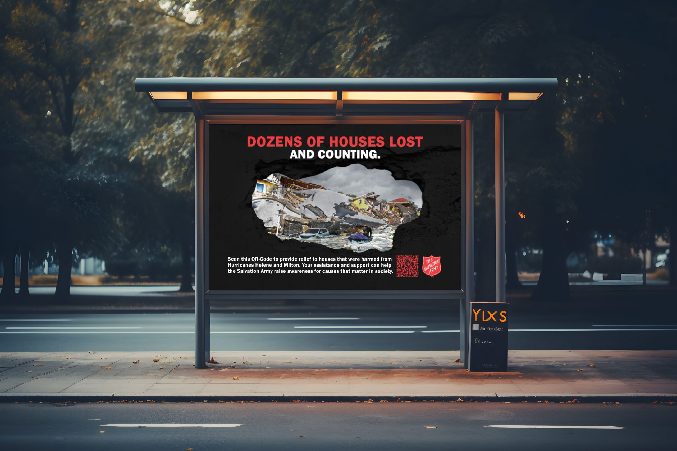
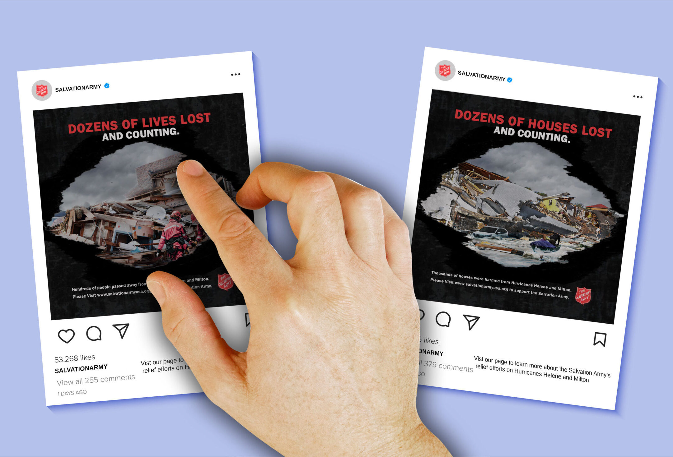
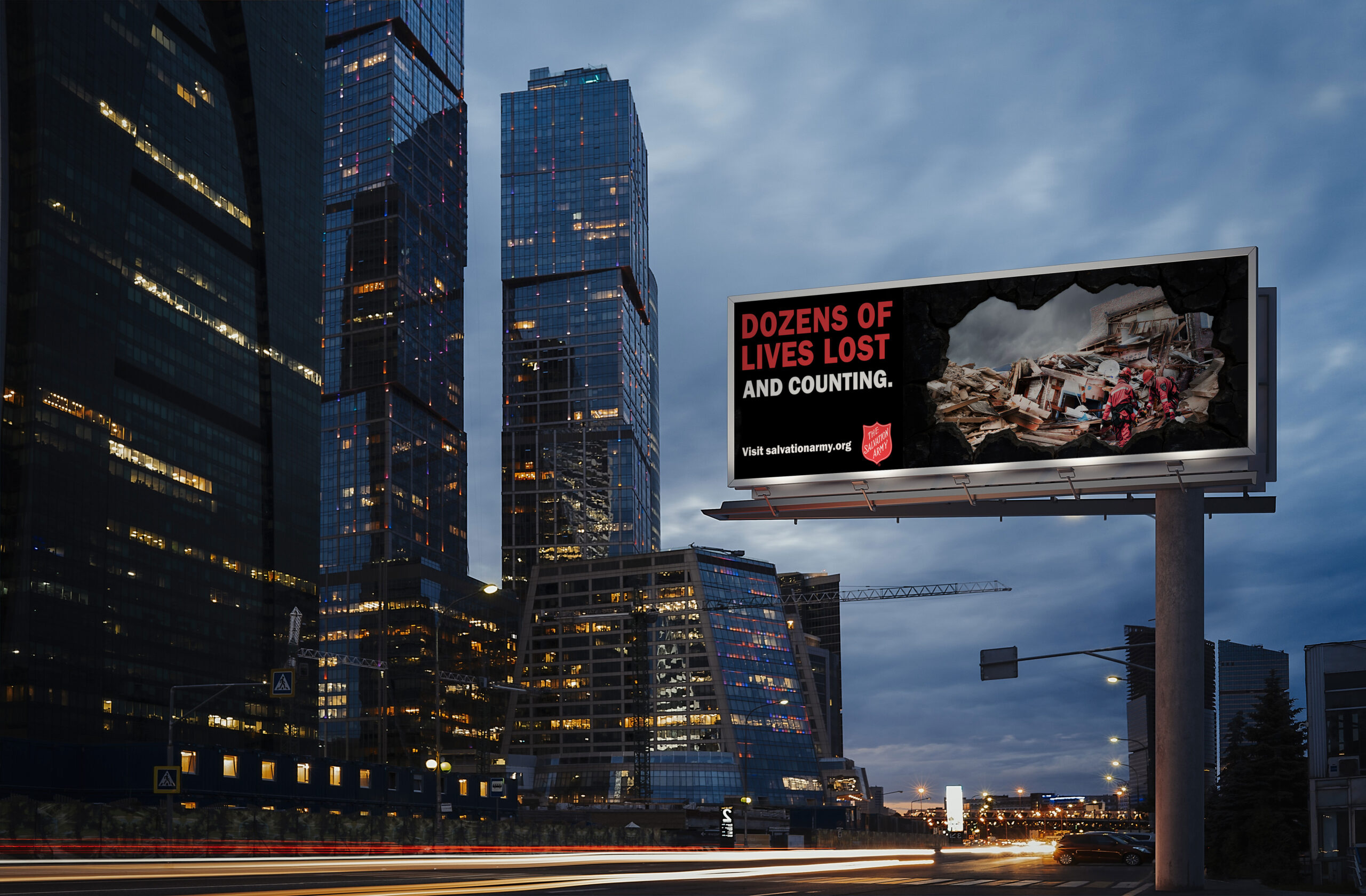
Salvation Army Advertisement Campaign and Prototype Presentation
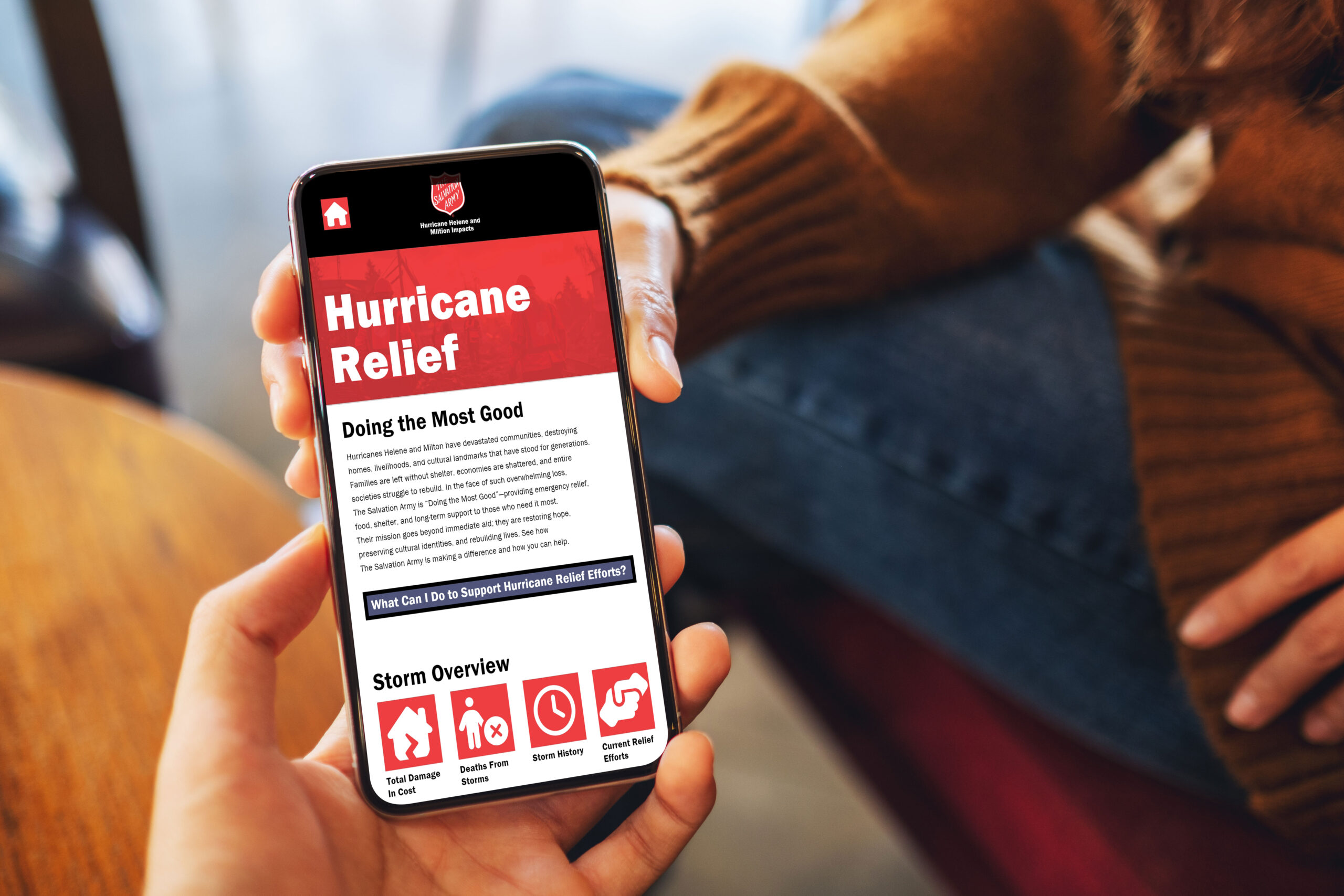

Presentation Link
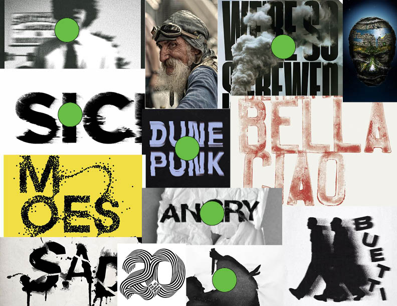
Moodboards

Solution
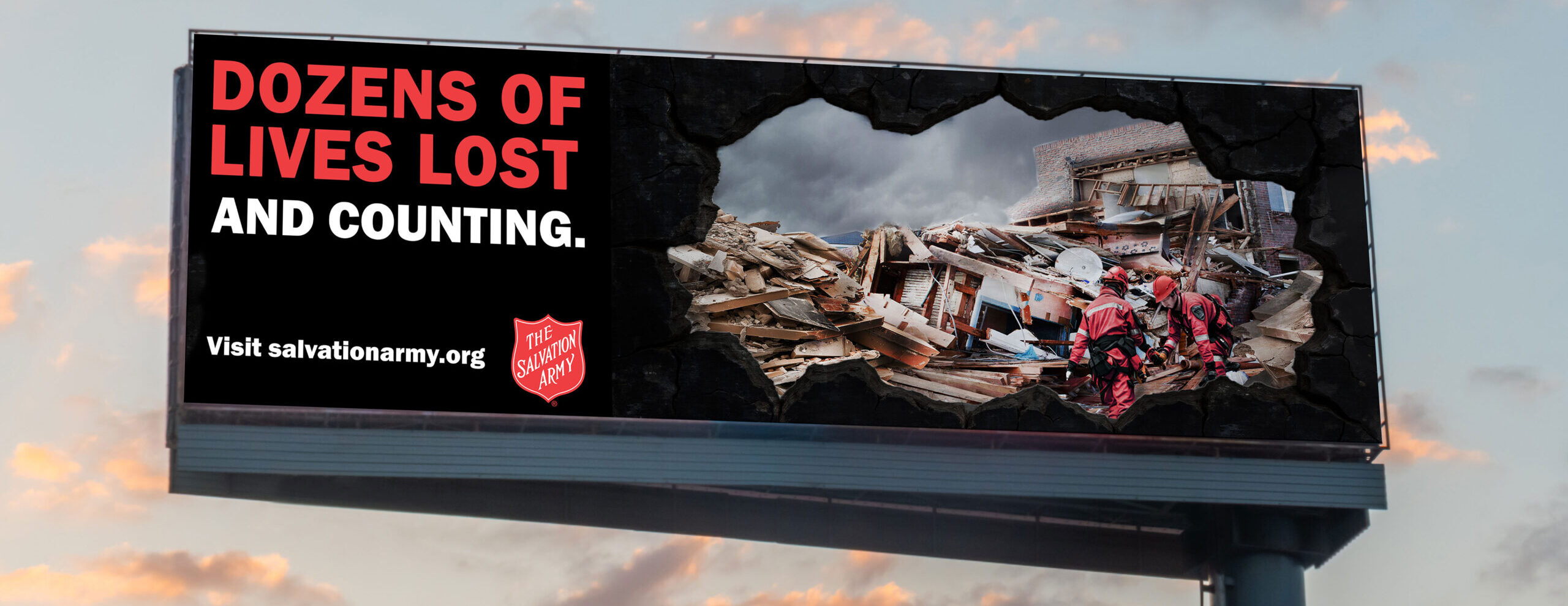
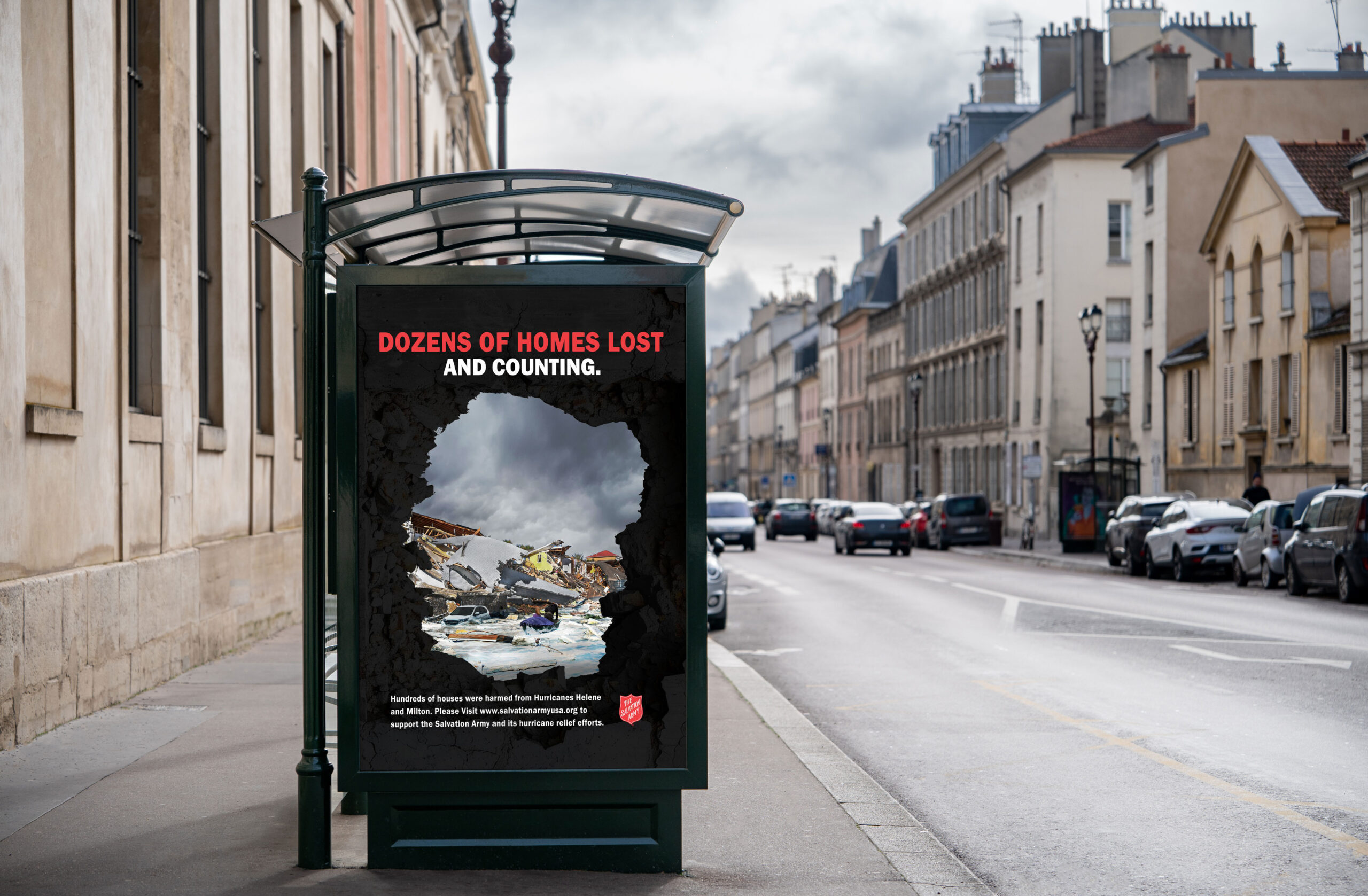
To increase engagement, the Salvation Army’s campaign consists of billboards, social-media posts, a QR-code, and an 8.5 x 11 flyer. The tone of the campaign is communicated through the broken, metallic, rustic frames that represent destruction. Sharing the Salvation Army color palette, the color scheme sets the tone with red and white typography that creates a sense of emergency. Three themes were emphasized: deaths, destroyed houses, and ruined towns. By depicting Salvation Army volunteers searching for bodies, a flooded street, and a wrecked town, each theme uses an emotional reaction to encourage donations to the Salvation Army.
Each advertisement, except for the billboards, has body copy that showcases statistics and a call to action to visit the Salvation Army’s website. A digital presentation, showing the Salvation Army’s brand identity using contrast, imagery, and type hierarchy, reinforces the hurricane impacts further.
Project Outcome
The campaign uses a brand color palette, dramatic imagery, typography, and body copy to solicit an emotional reaction and promote donation. Through the campaign, an increase in hurricane awareness, donations, and participation will lead to an anticipated 46% increase in Salvation Army relief efforts.


