Design Challenge
Online video game shopping has been prevalent for the past few years. People rely less on purchasing physical copies of video games since consoles have online stores. As a result of this problem, Game Stop’s income and business has plummeted.
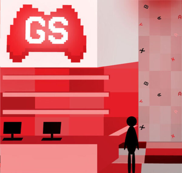
Interior Front

Logo
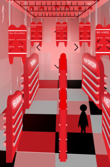
Interior Main Store
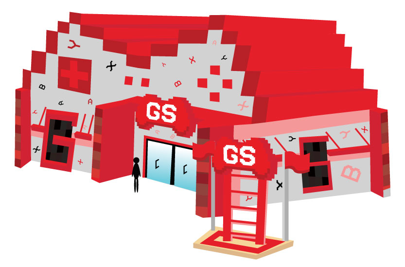
Re-Branded Exterior
Color Palette
HEX: #f57421
RGB: 228, 31, 40
PANTONE: 485 C
HEX: #d1d1d1
RGB: 209, 209, 209
PANTONE: Cool Gray 2 C
HEX: #f59898
RGB: 245, 152, 152
PANTONE: 708 C
HEX: #000000
RGB: 0, 0, 0
PANTONE: Black 6 C
HEX: #cf2331
RGB: 207, 35, 49
PANTONE: 1795 C
HEX: #b81a24
RGB: 184, 26, 36
PANTONE: 7621 C
Typeface Study
![_Mankin_Peter.indd @ 75% [Converted] 4_21_2025 4_12_43 PM Typeface study showcasing PF Video Text as header, Futura typeface as body copy, and sizes of each heading, sub-header, and body copy.](https://www.pmanx-the-designer.com/wp-content/uploads/2025/04/Mankin_Peter.indd-@-75-Converted-4_21_2025-4_12_43-PM-e1745266528566.png)
Solution
By completing research, mood boards, and sketches, a comprehensive logo and store environment were created to re-brand Game Stop. Using Adobe Illustrator, a retro-based concept was developed to remind people of nostalgic elements of gaming.
By having a critique of the brand and logo, the re-brand was established to encourage older Game Stop to return to Game Stop and market Game Stop to younger gamers.
Project Outcome
The outcome of Game Stop’s re-brand is that the brand will rise back into the competitive gaming market. There will be an increase in foot traffic and interest in GameStop’s products as a result of their re-brand. The concept behind Game Stop’s re-brand will help prioritize an improved gaming experience for gamers.


